Kitchen Cabinet Color Ideas: Transform Your Space in 2025
Feeling stuck with boring kitchen cabinets? Trust me, I’ve been there. Those sad, lifeless cupboards can totally make or break your kitchen’s entire vibe.
Let’s dive into the coolest cabinet color trends that’ll make your kitchen pop – without breaking the bank or looking like you tried too hard.
🏠 Steal This Look
- Paint Color: Sherwin-Williams Naval SW 6244 for a bold, modern statement or Sherwin-Williams Agreeable Gray SW 7029 for timeless versatility
- Furniture: sleek bar stools with clean lines and neutral upholstery to complement colorful cabinets
- Lighting: pendant lights with brass or black finishes to enhance cabinet color depth
- Materials: quartz countertops in white or light gray to balance bold cabinet colors, brushed gold or matte black cabinet hardware
I love how the right cabinet color can completely transform a kitchen’s personality – from cozy farmhouse charm to sleek contemporary elegance. It’s amazing what a fresh coat of paint can do to make your kitchen feel like a whole new space.
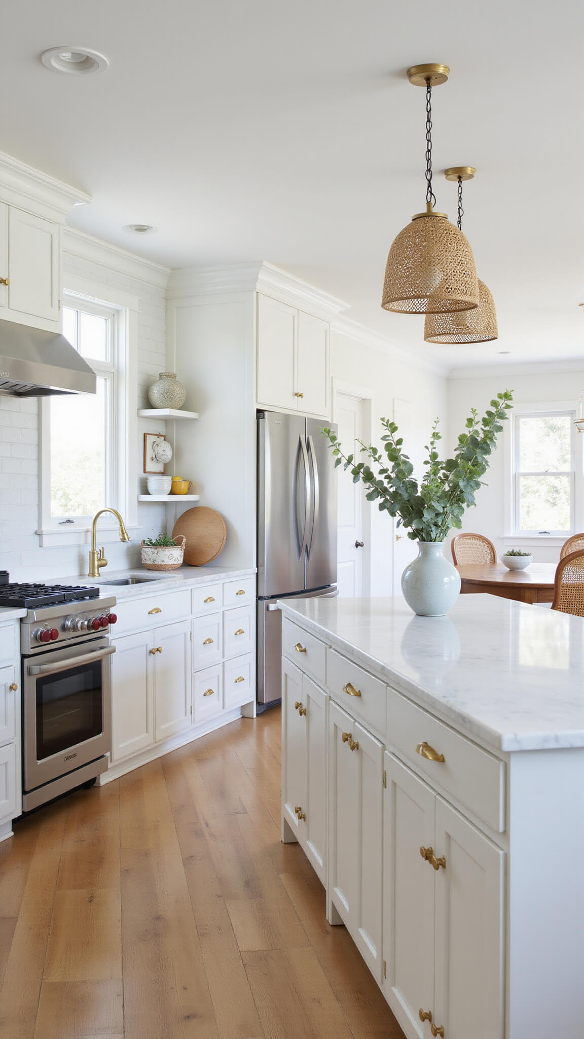
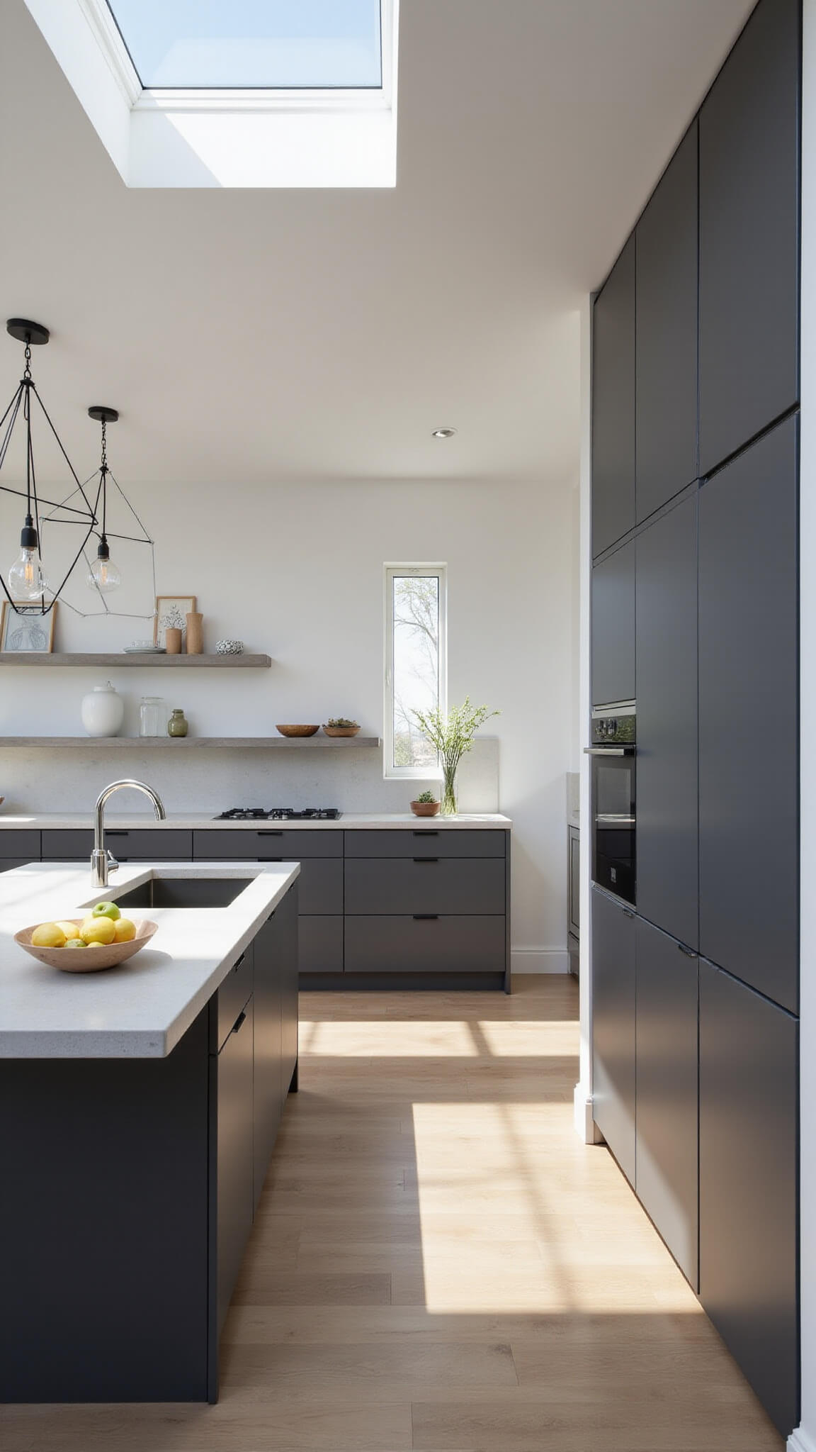
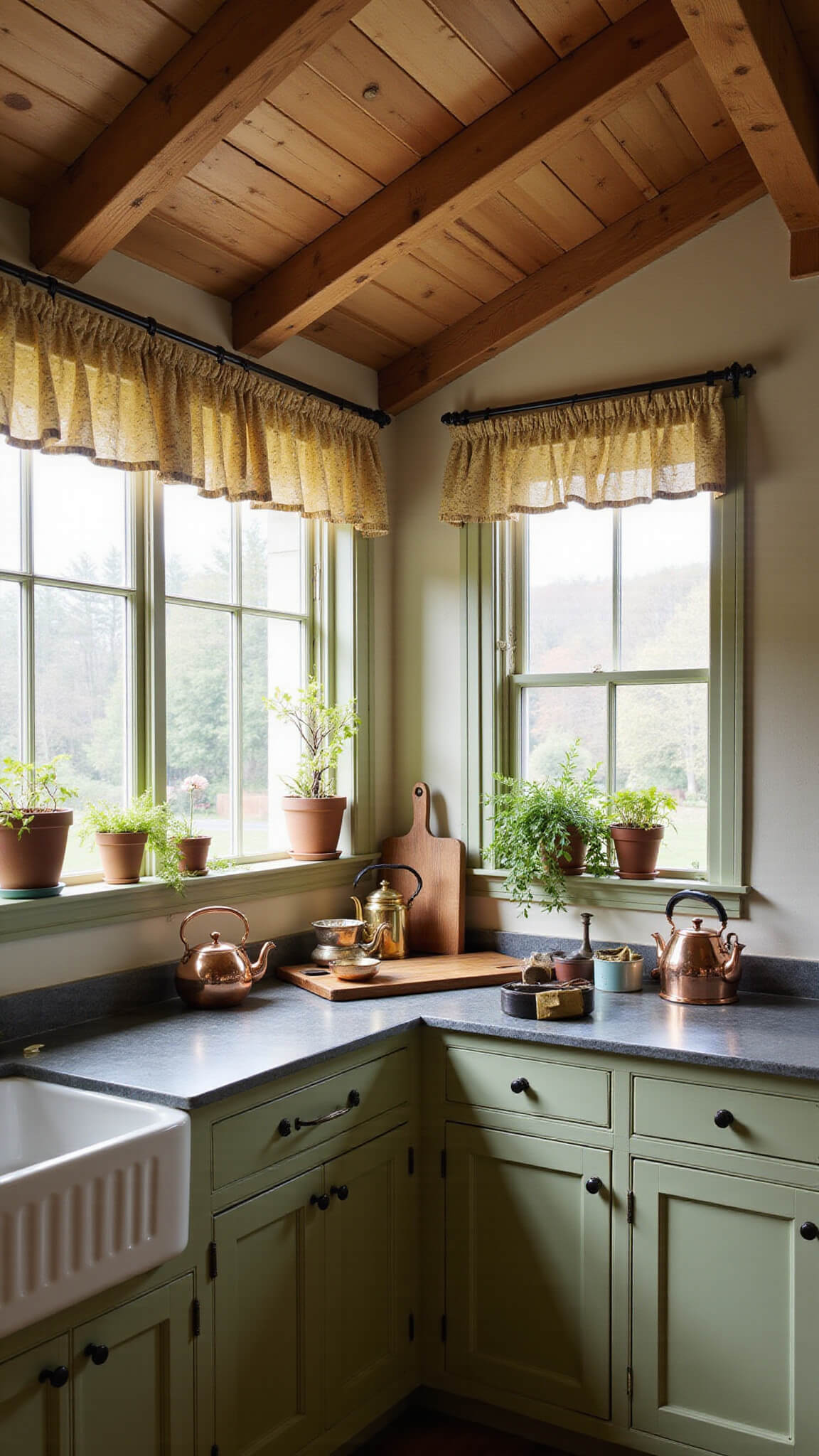
White and Neutral: The Safe but Stunning Classics
White ain’t just white anymore, folks. We’re talking about those dreamy, nuanced shades that make your kitchen look like it jumped straight out of a design magazine.
Pro Tip Alert: My go-to whites that never disappoint:
- Benjamin Moore’s Chantilly Lace (crisp and clean)
- Sherwin-Williams Alabaster (warm and inviting)
- Soft off-whites that whisper elegance instead of screaming “hospital kitchen”
🖼 Steal This Look
- Paint Color: Benjamin Moore Chantilly Lace OC-65 for crisp clean cabinets or Benjamin Moore Cloud White OC-130 for a softer approach
- Furniture: natural wood bar stools with white or cream upholstery to complement neutral cabinet palette
- Lighting: brass or warm gold pendant lights to add warmth against white cabinetry
- Materials: white quartz countertops with subtle veining, subway tile backsplash, brushed brass cabinet hardware
There’s something so timeless about a white kitchen that feels both fresh and sophisticated. These aren’t the stark builder-grade whites of the past – they’re carefully chosen neutrals with real personality.
🎁 Get The Look
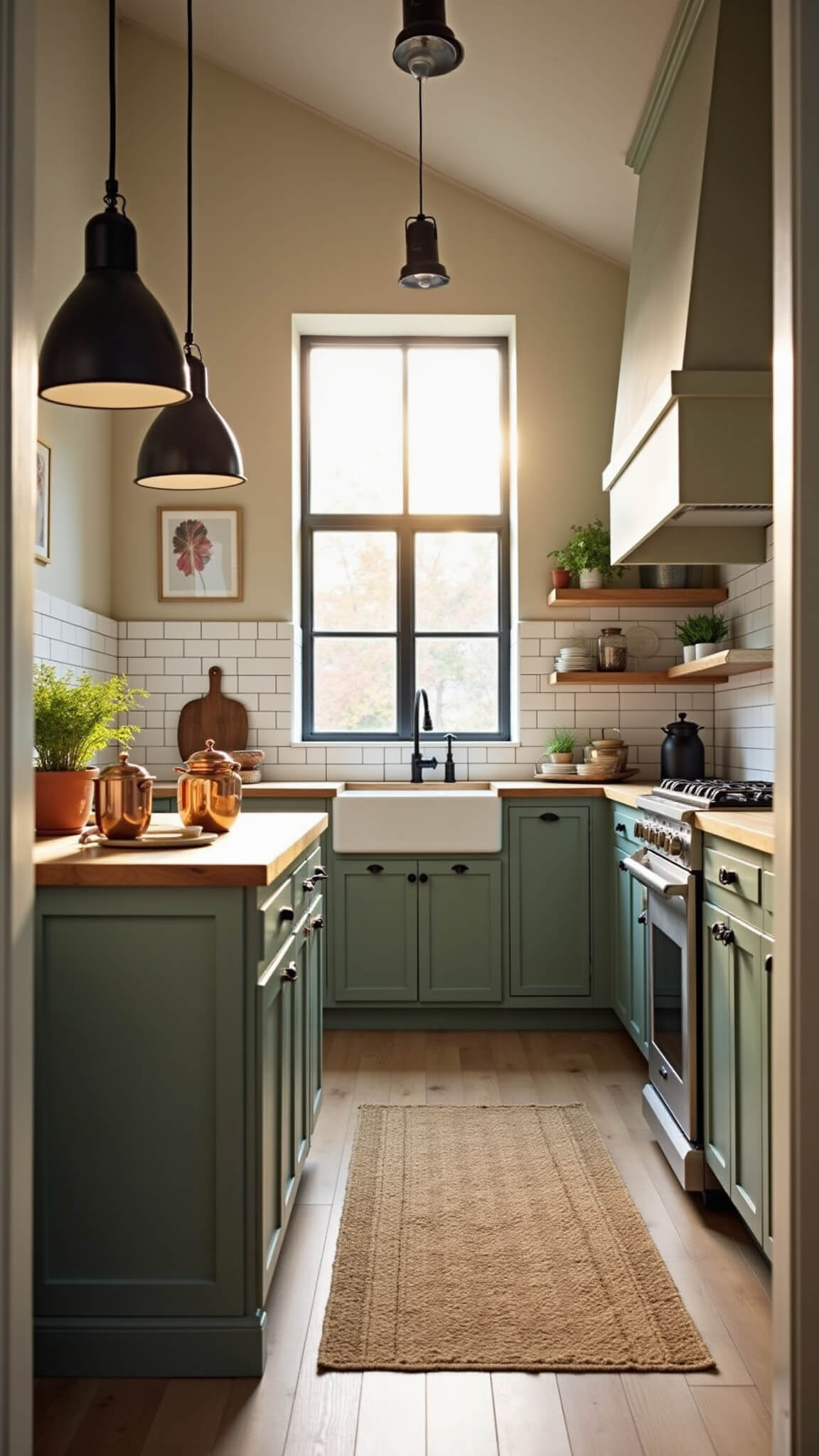
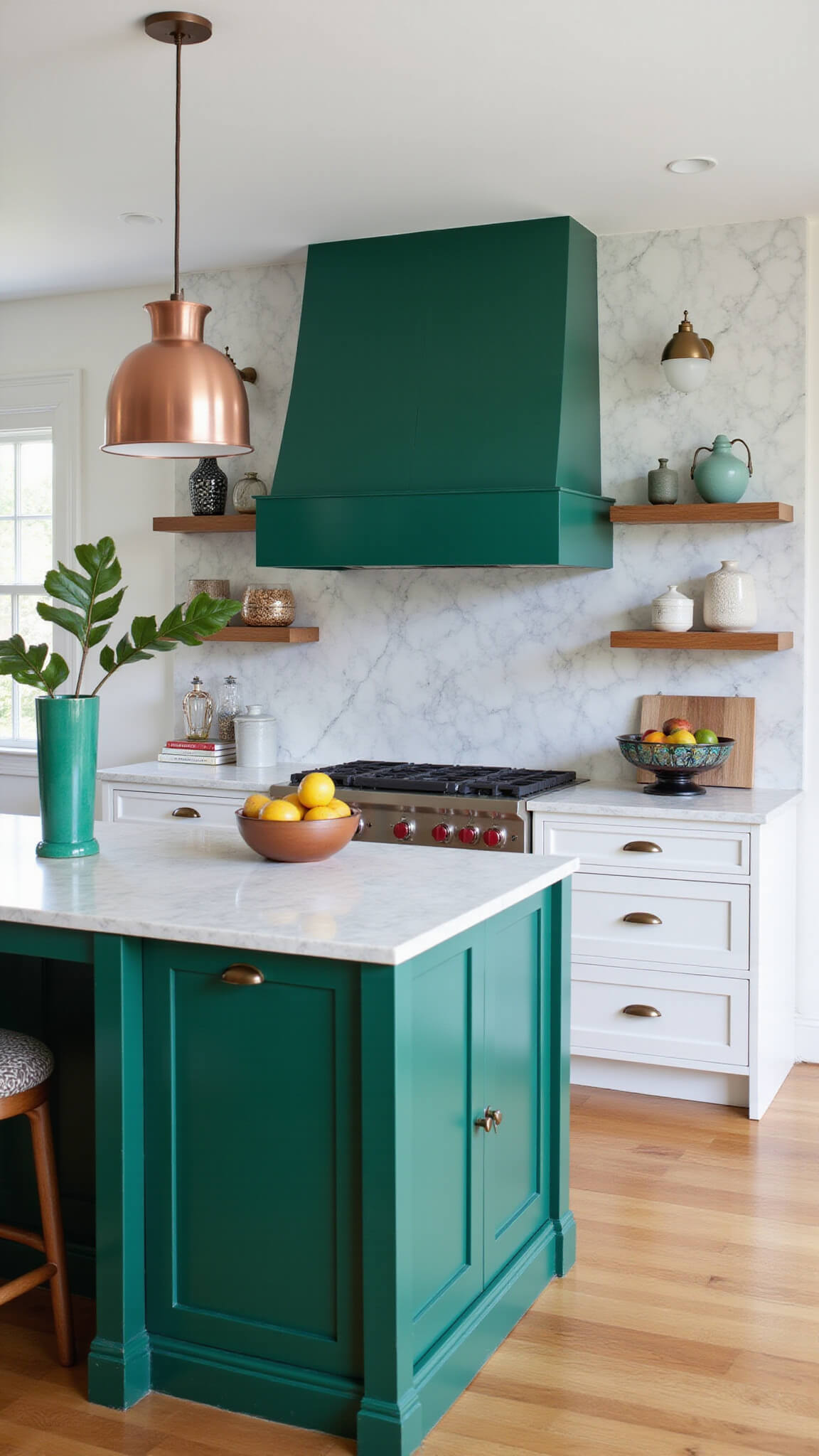
Nature’s Palette: Greens and Blues That Actually Work
Forget those weird, dated green and blue kitchen nightmares from the 80s. We’re talking sophisticated, grown-up colors that make your space feel alive.
Green Vibes:
- Sage green (think zen meets modern)
- Earthy olive tones
- Emerald for those who want a bold statement
🖼 Steal This Look
- Paint Color: Farrow & Ball Green Smoke 47 for sophisticated sage tones that bring natural serenity to kitchen cabinetry
- Furniture: Natural wood bar stools with live edge details to complement the organic color palette
- Lighting: Brushed brass pendant lights with clear glass globes for warmth against green tones
- Materials: Honed marble countertops, brass cabinet hardware, and natural wood accents
There’s something incredibly grounding about cooking in a kitchen wrapped in nature’s own colors. These sophisticated greens create a space that feels both energizing and peaceful.
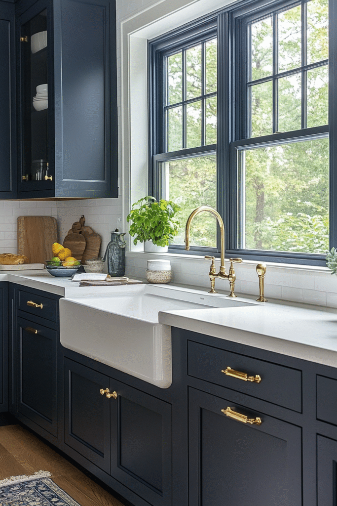
Blue Moods:
- Navy (always classy)
- Slate blue (for the design-savvy)
- Teal (when you’re feeling adventurous)
💡 Steal This Look
- Paint Color: Behr Naval S400-7 for navy cabinets, Behr Storm Cloud S520-5 for slate blue, or Behr Tidewater T18-15 for teal
- Furniture: brass bar stools and warm wood dining table to complement blue cabinet tones
- Lighting: brass or copper pendant lights to warm up cool blue cabinetry
- Materials: marble countertops, brass hardware, and natural wood accents
Blue kitchen cabinets instantly elevate your space from basic to sophisticated. Whether you choose classic navy for timeless appeal or adventurous teal for personality, blue creates a kitchen that feels both calming and confident.
👑 Get The Look
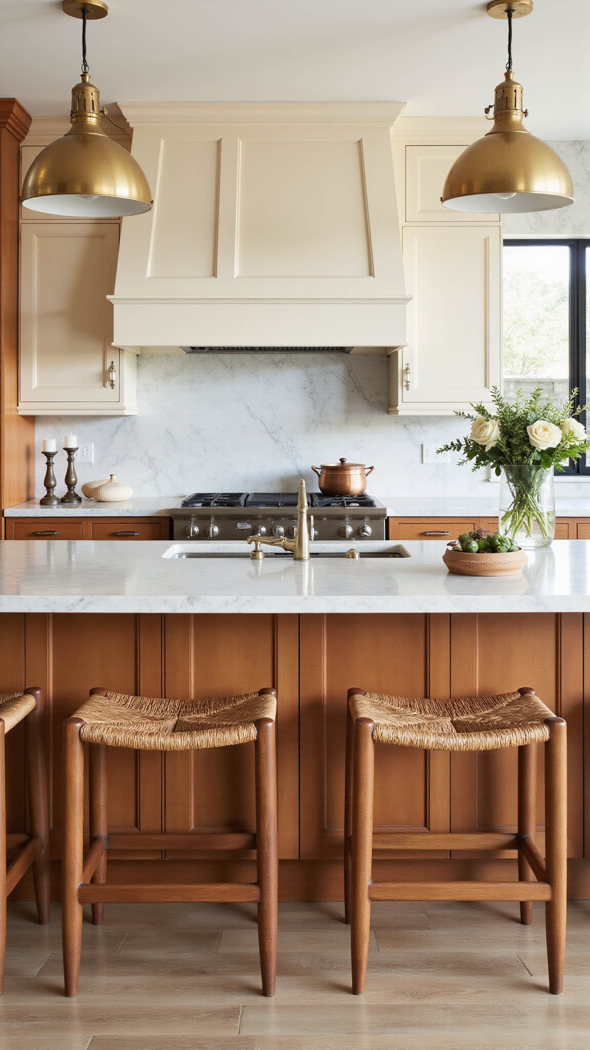
The Bold and the Beautiful: Accent Colors
Wanna make a statement? Here’s where you get playful:
- Sunny yellow island
- Deep charcoal lower cabinets
- Two-tone magic (white uppers, colored lowers)
🎨 Steal This Look
- Paint Color: Valspar Sunny Veranda 3009-3A for sunny yellow island accent, paired with Valspar Chalet Blue 4008-2B for deep charcoal lower cabinets
- Furniture: natural wood bar stools with black metal legs to bridge the color contrast, marble-top kitchen island with waterfall edge
- Lighting: brass pendant lights over island to warm up the bold color scheme, under-cabinet LED strips for task lighting
- Materials: quartz countertops in warm white, subway tile backsplash, brushed brass cabinet hardware
Two-tone kitchens are having their moment, and for good reason – they let you experiment with color while maintaining sophistication. The key is choosing colors that share an undertone for cohesion.
Practical Picking Tips
Before you go color crazy, remember:
- Check your lighting (colors look different everywhere)
- Sample, sample, sample
- Consider your kitchen’s existing elements
Real Talk Moment: I once painted my kitchen without testing, and let’s just say… it was a disaster. Learn from my mistakes!
🖼 Steal This Look
- Paint Color: PPG White Dove PPG1015-1 for upper cabinets with PPG Iron Ore PPG1023-7 for lower cabinets – creates balanced contrast for color testing
- Furniture: kitchen island with butcher block countertop for color sampling workspace
- Lighting: under-cabinet LED strip lighting to test paint colors in different light conditions
- Materials: wood grain textures, quartz countertops, brushed nickel hardware finishes
We’ve all been there – falling in love with a paint color only to realize it looks completely different once it’s on the cabinets. Taking time to properly sample prevents expensive do-overs.
🎁 Get The Look
What the Pros Are Saying
Design experts are ALL about:
- Organic, earthy tones
- Natural wood finishes
- Colors that tell a story
Budget-Friendly Advice
You don’t need a millionaire’s budget to look like a design pro. My secrets:
- Paint is cheaper than replacement
- One accent area can transform everything
- Quality matters more than quantity
Where to Get Inspiration
My top spots for kitchen cabinet color ideas:
- Pinterest (endless scrolling)
- Design blogs
- Paint brand websites (they’re actually super helpful)
Final Thoughts
Picking a cabinet color isn’t rocket science – it’s about what makes YOU happy. Your kitchen should feel like home, not a showroom.
Pro tip: Break the rules. If you love it, it works.
Disclaimer: Colors may look different on your screen. Always test in your actual space.
★ Steal This Look
- Paint Color: Dunn-Edwards Balanced Beige DE6124 for a versatile neutral that works with organic, earthy tones and natural wood finishes
- Furniture: natural wood bar stools with live edge details and warm undertones
- Lighting: warm brass pendant lights with natural materials like rattan or wood accents
- Materials: natural wood grain, warm brass hardware, stone countertops, organic textures
The best kitchen cabinet color is one that makes you smile every morning when you walk in for coffee. Design rules are meant to guide, not dictate your personal style.


